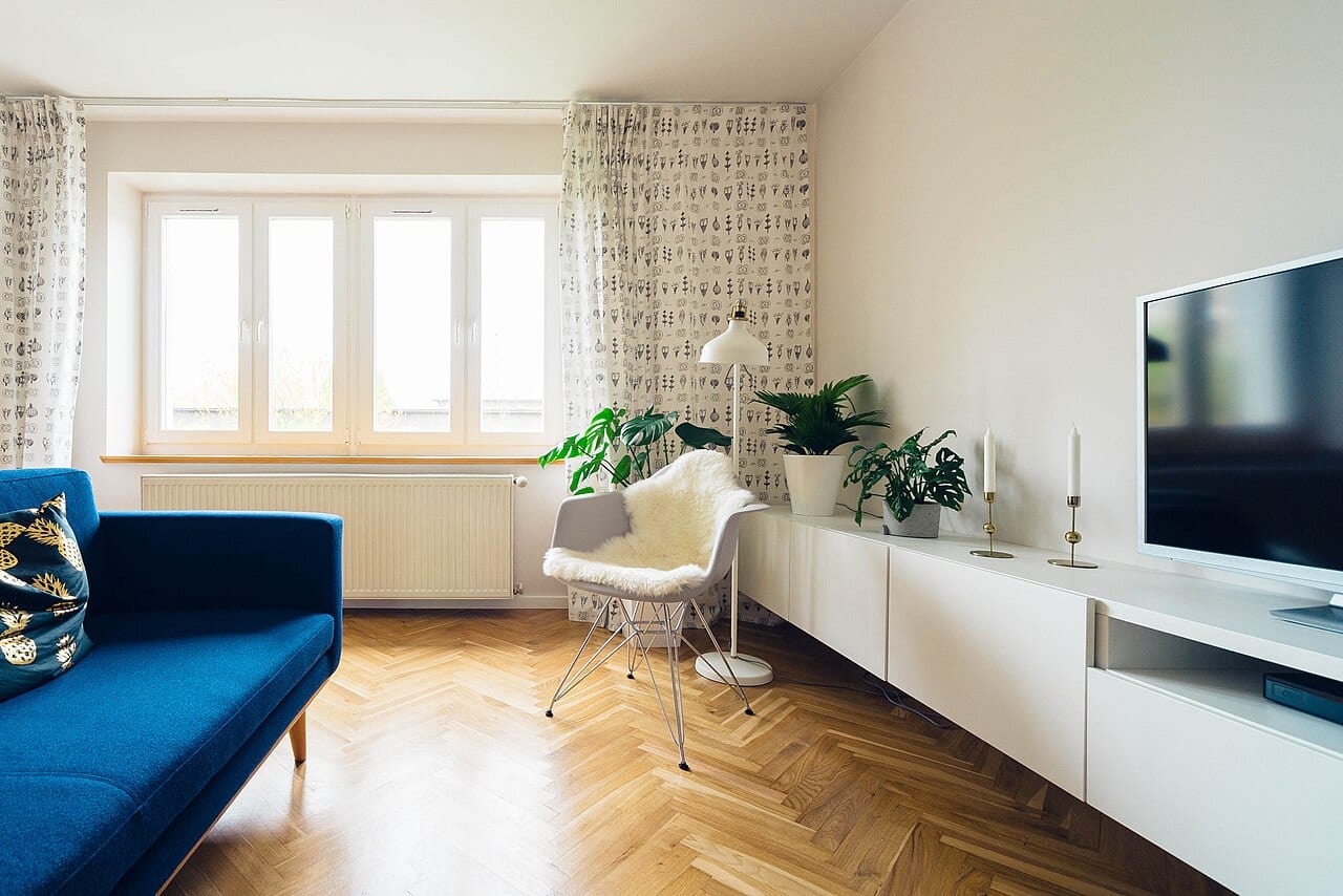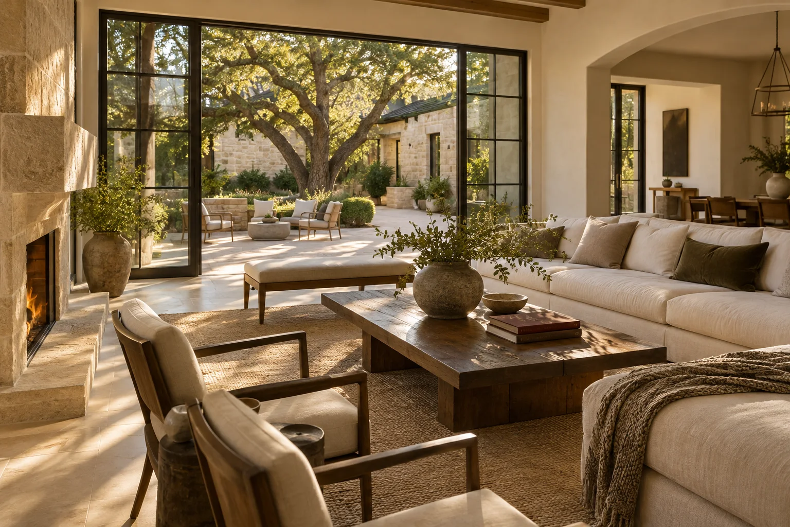
There is a particular kind of mental clutter that comes with a postponed home project. You might have walked away from the paint aisle months ago, deciding that the time for color changes wasn't right, only to find yourself staring at the same neutral walls today. The decision feels heavier now because the initial excitement has faded, replaced by the practical reality of a task that needs completion.
Moving beyond the swatch
Returning to this choice requires more than just picking up where you left off. The light in your living room in the middle of a North Texas summer afternoon is not the same light that greeted you during a spring renovation plan. To make a decision that sticks, you must move beyond the small paper swatches found in a store aisle. The environment itself is the most important tool you have for testing.
When you begin testing, the first step is to move the samples into the environment where they will live. Instead of holding a tiny card against a wall, apply the colors to larger surfaces. For example, if you are choosing a shade for a dining room, paint several distinct sections on a piece of sturdy board or directly onto a section of the wall that can be easily covered later. Label each sample immediately with a piece of painter's tape. Include the specific name or code you selected so you do not lose track of which shade is which once the colors begin to blend together in your mind.
Without these labels, you may find yourself standing in a room surrounded by three nearly identical shades of beige, unable to remember which one was the warm sand and which was the cool stone. A clear labeling system turns a collection of random spots into a controlled observation. This allows you to move through the room and compare colors without the confusion of forgotten identities.
The rhythm of the room
A color is not a static object; it is a participant in the room's atmosphere. To compare samples fairly, you must observe them at different intervals. A shade that looks crisp and bright during the morning sun might shift toward a heavy, muted tone once the sun sets and your indoor lamps take over.
Imagine you are deciding between a pale blue and a soft grey for a bedroom. In the bright morning light, the blue might appear vibrant and energetic. However, if you only look at it during that window, you might be surprised by how dark or somber it feels during your evening wind-down routine. For a meaningful tradeoff, consider how much you value morning brightness versus evening coziness. Ask yourself if you prefer a color that reacts dramatically to the sun or one that maintains a steady, predictable tone throughout the day.
Finalizing the selection
To finalize your choice, spend time in the space during the specific hours you use it most. If the room is a workspace, check the samples during your peak productivity hours. If it is a sanctuary for rest, observe them as the day ends. Once you have seen how each labeled sample performs under your actual daily lighting, the right choice will reveal itself through observation rather than guesswork.